What should a FreeCell game look like?
The look and “feel” I’m going for is the Windows 95 one. It’s not exactly the original one, though. As we mentioned last time, the game concept itself dates back to 1978, but that was on a PLATO system, amber monochrome with minimal graphics1 that’s not really worth reproducing nowadays. Windows 95 distributed an implementation of it. It wasn’t developed for Windows 95, merely distributed within, yet that’s the one that made it popular.
As far as I know, it was the same version that used to be distributed as a part of Microsoft Entertainment Pack 2, developed for Windows 3. Except it got ported to Win32s in the meantime, seeing as it was used as a demonstration of Win32s thunking. I’ll assume they didn’t change the code too much, or that demonstration wouldn’t have served much purpose.
From what I recollect, the cards themselves were the same as Windows’s Solitaire’s, so they’re even older. Here’s what one of them looks like.

71 pixels wide, 96 high, border included. Assuming a VGA square pixel aspect ratio, that makes for a 1.34:1 card, even more square than a typical poker card. So perhaps its design dates further back to EGA resolutions? That would make it 1.85:1, taller than bridge cards, almost in Tarot territory. Seems unlikely. Let’s settle for “I don’t know,” then.2
What I do know is that the SDK’s expected size and resolution is 1920×1080. Easy, I’ll just zoom a standard 640×480 maximized window and be done with it, right?
Uh, no.
Obvious no because 1920×1080 is 16:9 whereas 640×480 is 4:3.3
Less obvious no because even if we scale by a square multiplier… Well, it’s still better illustrated than spelled out.

I know, right? This won’t do!
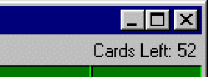
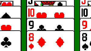
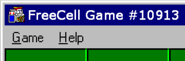
Let’s add close-ups, zoomed even further in to better showcase the issue.


Please ignore the dithering in the menu bar. I’m not sure where it comes from,4 but it’s not the matter at hand. It’s easily cleaned up anyway.
I’m all for having a pixellated look on oldies’ remakes, but that shouldn’t preclude them from looking good.
So what’s wrong, really? Well, to make it simple, scaling a 480px-high image to 1080p involves multiplying by 1080⁄480=9⁄4=2.25. Which is not integral at all. Roughly speaking, this means most pixels are scaled ×2², but one out of four is scaled ×3². Hence the jagged borders in the diamonds’ suit symbol. Hence the vertical5 sides of the digits having differing widths depending on where they happen to appear in the frame. Hence the blotch in the middle of the window close button, and its curious right ends. And hence the text looking like… I wouldn’t even know where to start describing what’s wrong with it.
Yeah, this definitely won’t do.
What are the options?
The menu bar is static; it could be edited once and for all. The application icon could be redrawn as well. But the game number is different for every game, and the card counter is as dynamic as it gets.
The font used in all visible text—the window title, the menu bar and the card counter label—is default system font MS Sans. It’d be tedious (and kind of irrelevant) to excavate whether it was already TrueType or still bitmapped at the time, but the point is it was pixel-based, no bigger, no smaller. With that era-unique hack of faking bold face by overlaying the same text one pixel to the side.6
For the title bar, I’ve tried keeping the original zoomed layout, hand-correcting the jagginess, and inserting the game number using a regenerated subset of the font I found online. It didn’t pay off. It put me in the middle of a vicious battle between the GIMP and PIXI, each scaling their part in their own way, refusing to acknowledge the other’s, always adding up to some uncanny experience.
The card counter presented a slightly different challenge: the font rendering itself could be static, but the label as a whole has to be right-aligned. So it has to adjust to the count’s rendered width. And that font isn’t monospace.7
Let’s talk layout for a bit.

The original layout has four cells and four foundations top-aligned, with a little friendly face character in the middle. Cells and foundations are packed, so we’re at eight cards’ width and some buffer. There are also eight cascades, but they’re evenly spaced in the window. They can hold a maximum of nineteen cards: the seven initial ones augmented with a full tableau.
Going from 4:3 to 16:9 opens a bit of space on the sides. What use could we make of it? I haven’t found any.8 Any opening there just… adds lateral space. Of which we’ve already got enough. And that’s with superpoker-format cards.
Talking about cards, how are we going to handle them? The clubs are asymmetrical, the diamonds are jaggy, and the faces… There’s really no way they could look good in high resolution sticking with the original assets. Which aren’t really licensed for use by yours truly anyway.
So the sentence isn’t going to be a surprise: the cards will have to be replaced.
I’m not drawing faces by hand. Too lazy. Not talented enough. It’s in my other pants. CBA. Your pick. Luckily enough, there are plenty of available alternatives, designed by people who actually know what they’re doing.
But… they won’t be superpoker. They probably wouldn’t even be poker. Which isn’t a problem per se. It just means that where we didn’t have much use of lateral space, rendering our cards will leave us with even more free space on the side. For which we’re still out of inspiration.
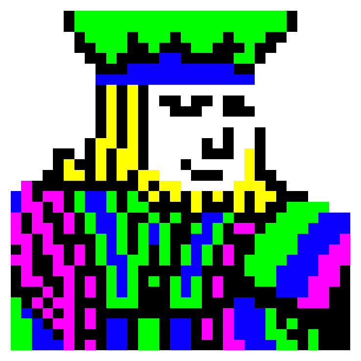
And switching them has further-reaching consequences: both the cutesy icon in the middle and the victory screen are bitmap derivatives of the king of spades.

Don’t let yourself be fooled by the shift in the color palette, or the fact the center icon follows your click without turning its body:9 those three are very related indeed.
But enough beholding the mountain ahead of us. Let’s start scaling!
So I scaled the10 original screenshot from 640×480, standard-themed Windows 95 decorations, to 1440×1080. Centered in an ocean of transparency.
I replaced the fuzzy scaled application icon with the original 32×32 one from the PE resources. It’s not cheating it’s hacking: it’s not the icon that appeared in the original title bar, but it is the icon that would have been displayed in Windows 3’s Program Manager. Mmm, that wouldn’t be too visible anymore in Windows 95’s Start menu, would it? Well, you could still see it if you opened the Start menu in the Explorer. Oh, or much easier: with Alt-Tab. Come to think of it, 32×32 sounds like a bit much for the era. Well, I’ll admit I don’t know the minute detail of its lineage, but it’s Authentic, ok?
Also, it fits the scaled hole almost perfectly.11
Oh, and if you hadn’t noticed, it’s our old faithful the king of spades, there in the background. I’ll get to you, just you wait.
For the application title, that includes the game number, I patched together a dedicated PIXI bitmap font in the appropriate size. The text part is TrueType Microsoft Sans Serif, which is not the same as MS Sans Serif, but was introduced as a drop-in metric-compatible vector replacement, starting with Windows 2000. I had no idea before digging this up.
I played a bit with it to get a grasp of its digit kerning settings, and tried a few variations between several “shadow displacement” bold implementations and the actual boldface of the newer font. The round letters such as C and G are a bit too round now to make for a perfect substitute, but it is the setting that gave me the best pleasantness×fidelity combination.

I cleaned up the window management buttons to the right of the title bar. This mostly entailed clearing the dithering in all of their backgrounds, and redrawing the close button from scratch to eliminate any trace of aliasing.
While I was at it, I cleared the dithering in the entire window frame and in the menu bar.
In that same menu bar, I kept the menu entries as scaled from the original. But I cleaned them up one pixel after the other to avoid the glaring unpleasantries.
Right of the menu bar, the card counter. Mostly the same deal as for the application title: I put together a PIXI bitmap font in the appropriate size. This one’s rendering is actual MS Sans, in its original bitmapped size, scaled and pixel-patched to make it readable. If you look very closely, you can tell measure it can’t be the original because the scaled pixels don’t make for an integral number of pre-scaling VGA pixels. My editing consisted mostly in pushing those differences to places where they wouldn’t be noticed: packed with other pixels.
I picked a nice-looking set of SVG playing cards from WikiMedia Commons. I figured SVG was perfect, as I could generate PNGs from them in whatever resolution I wanted.
SVG turned out to be better than perfect. SVG turned out to actually be an acceptable first-class input not only to PIXI, but also to the SDK’s sprite splitter!12 So in the end all I had to do was mass-offset the cards to the appropriate grid point, and the rest took care of itself on its own.13 Neat. I certainly expected a lot more pain and tears on this front.
That card set was a more normal 1.5:1, closer to bridge than poker, but still very much acceptable. I resized the cells’ and foundations’ placeholders accordingly. I also normalized their border width as it, you guessed it, scaled as unevenly as the rest.
All done, right?
Of course not!
As any programmer knows, after the first 80% of the work comes the other 80%. I still needed a victory screen and a central Mona Lisa.
Vector graphics is nice. Vector graphic is very nice when it comes to rendering at high resolution. Vector graphic doesn’t help one bit when what you need is a 32×32 4-colored bitmap.
So I took my king of spades SVG. And I framed an approximate square around his torso. And I had multiple pieces of software take a go at rasterizing him. And I repixelled most of him anyway. And I converted him to a 4-color indexed palette. And I scrubbed out the sword. And I drew what could have been the rest of his formal attire. And I flipped his head. And I drew what I imagined was beneath his beard mere instants ago, whilst he still gazed the other way. And I exported three hard-earned PNGs.

So yeah, in the end there’s not much of the published game that’s really traceable back to the scaled original anymore. But I claim I took my best shot at preserving its spirit, in a pixellated high-resolution environment.
Here’s a sample game. (You may want to open it fullscreen, or you won’t be able to observe much, if any, of what’s been discussed here.)
The animation timings will likely undergo another round of adjustments, but as far as the graphics go, I’m quite pleased with the result.
Four to five SDK bugs were uncovered in the making. I’ll report those that don’t appear too minor to be worthy of my usual “I told the devs about it” WONTFIX response. I’ll keep one around for my own nefarious use.
And now all you (and I) have left to do is solve the damn game!14
Thanks to @Astrobytes for pointing out my typos!
I’d include a screenshot if I had any idea of the origins of those strewn across the web. Well, they’re not that hard to find, you can manage if you’re curious.↩︎
But I’d like to, and you’re welcome to tell me about it.↩︎
And square pixels are the standard now. Thank god.↩︎
I haven’t had a Windows-based machine in a quite a long time, so I’m relying on screenshots of dubious origin gathered on the web.↩︎
TBF, the horizontal sides too, but they’re much less likely to be noticed.↩︎
I didn’t believe it at first. But then I reproduced it.↩︎
Depending on the counter’s rendering strategy, it can go from almost-monospaced to very-variable-spaced.↩︎
Any FreeCell-related use, that is.↩︎
Or the fact I get JPEG artifacts on a PNG because I can’t scour the web for The Perfect screenshot in short enough a time.↩︎
Well, “an”.↩︎
It’s two pixels short. At 1080p. Really, it’s fine.↩︎
I’m not sure how much of it is PIXI and how much of it is pure SDK.↩︎
I also oversized the ace of spades’s pip by hand. Attention to detail.↩︎
And upvote. Don’t forget to upvote.↩︎